In my last post, I talked about my journey to find an online publisher for my book about underwater New Jersey. I settled on Blurb and decided to design my book in Adobe InDesign, export the finished product to a Blurb PDF file and upload it for publishing. To accomplish the next step in the process, I used Adobe InDesign for the first time. I am pretty good with a computer and like most guys, I don’t read directions until after I should. I downloaded the templates for the book size (large landscape) and for the book front cover, spine and back cover. The front and back covers and spine need to be laid out in a separate file from the book. The front and back covers are larger than the book pages. I double clicked on the page template and it opened in InDesign. This is not an in-depth tutorial about using InDesign but I want to point out some things that will make the design process easier.
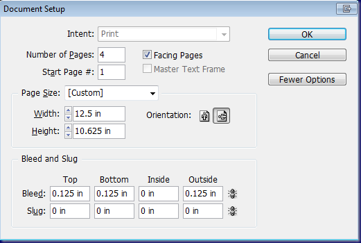
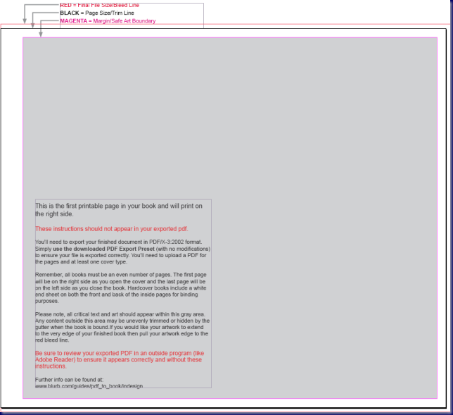
The book pages are 12.5” x 10.625”. You can change the number of pages to suit your needs. My finished book is 160 pages. The first page that opens in InDesign will have instructions about the layout of the pages:
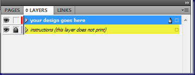
All artwork and text should fit within the gray are shown above. First (especially guys), read the instructions on this page. Of course, I didn’t but got lucky that I didn’t screw things up too bad. You can turn off these page instructions by clicking on the layers tab in the top right hand side of the page and click on the eye icon next to the box that says “instructions (this layer does not print).”
You will now have a blank page with a blue border around the page. This blue line is the boundary for images and text. Everything must be within that blue boundary. Next, set up your master pages.
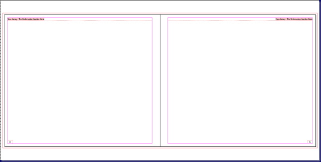
The pages above are my Master A pages. I put a text header at the top of both pages with the name of my book in each. The left page has text “left justified” and the right has the text “right justified.” You can also drag guides down from the top and side rulers to set up guides so that all your pages look the same. I put a text box in the bottom left hand corner. I used the text tool to click in the box, right clicked and chose “Insert Special Character” – “Markers” – “Current Page Number.” To get the page header and page number to the right hand page, I used copy and paste and then right justified each. An easier way to do it is to select the header, hold down the “Alt” key and drag it to the other page. It will automatically make a copy. Move it to the correct position, select the text and right justify it.
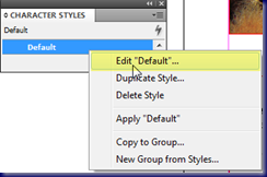
This is a good time to talk about text and a big mistake that I made on my first attempt. InDesign allows you to set up default text and paragraphs. For example, I used a font “Minion Pro”, 12-point, regular font style for my default font. You can access the “character styles” by choosing “type”, “character styles” from the top menu or using the “shift + f11” keyboard shortcut. Right click on “Default” and choose “Edit “Default”…”
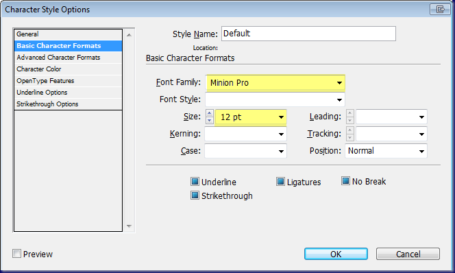
Click on the “Basic Character Format” in the left menu and change the font, font style and size etc. I did this after the fact and had already italicized some text and didn’t want to have to do it over. By not putting in a font style, I could highlight all the text and click on the default box and it would change it all to Minion Pro without affecting the font style. You can also make new character styles. I made one for caption headings and another for chapter headings. This helped me to keep everything uniform.
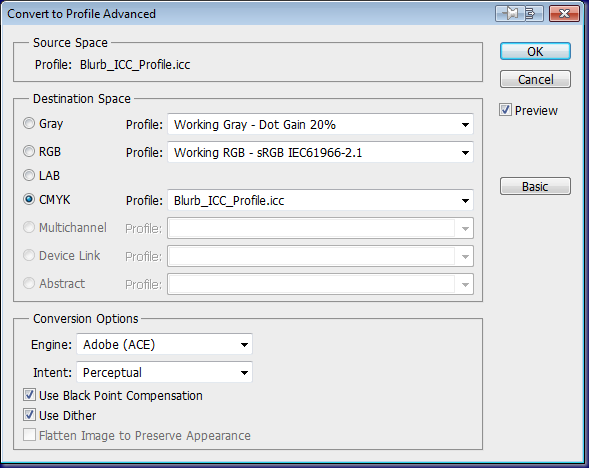
Setup is done for now and its on to prepare photos for the book. I went through my files and chose the photos that I wanted to use. The first concern is to be sure that the photos are large enough to be used on the page in the size that you require. Most of my photos are sized at 8” x 12” at either 240 dpi or 300 dpi, depending on the camera used for the photos. You will also need to convert the images to the Blurb profile (CYMK). Download the Blurb profile from their web site and install it into your image editing program. After it is installed in Photoshop CS5, I chose “edit”, “convert to profile” and used the following:
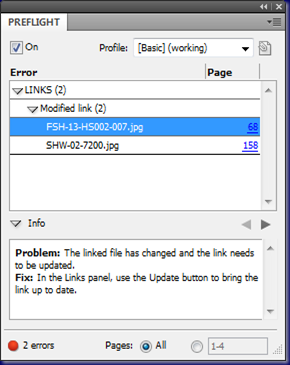
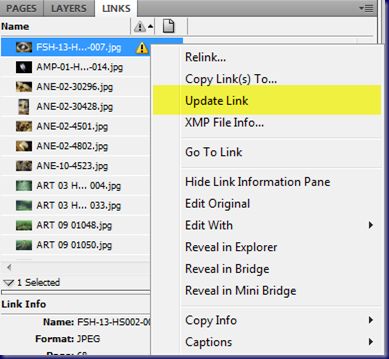
Of course, I didn’t realize this until I was almost done with the book. I downloaded the profile and installed it for Photoshop and then batch processed all the images to the new profile. InDesign links to the files so it is important to keep all the book files together. When an image file changes, InDesign sees the change and shows an error message in the “Preflight Panel.”
In the “Info” portion of the Preflight Panel (Left), the errors are explained. Both errors occur because the image file has changed since it was added to the document. Click on the page number (in blue) to the right of the image name and it will take you to the “Links” panel (right). Right click on the page number of the image with the yellow triangle and choose “Update Link” and all is well again.
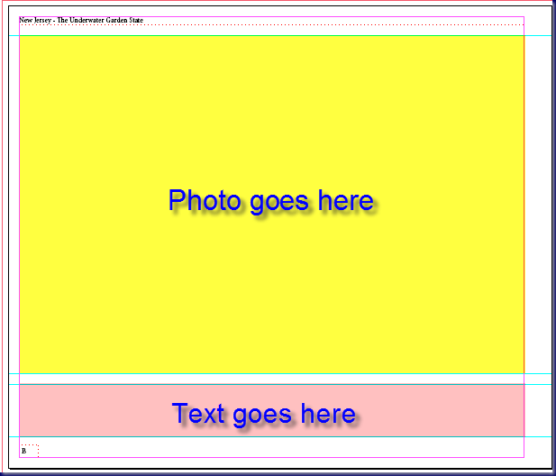
After selecting my images, converting them to the Blurb profile and saving them all in the same folder, it was time to start laying out my pages. Before I started, I made a few other master pages. One was for my full page images and text. I placed guidelines on the page for the photo and text layout. It was based on the “A Master” so it already contained the header text and page numbers.
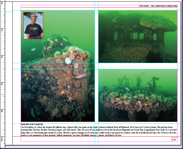
The color is here only to denote the different areas. It is not in my master template. I also made templates like this for the pages where I put photos of artificial reefs and shipwrecks. This is my “C Master” template with guidelines for photos and text.
Once the layout was complete. I printed the InDesign file to a PDF document and uploaded it to my web site. I sent the link to my good friends, Beth Dalzell and Marty Dick so they could download it and start their scrutinizing. Beth came back with a number of grammar and punctuation changes. Marty sent page after page of suggestions. He challenged my clumsy writing style and double-checked all my facts. I was not used to this kind of microscopic scrutiny and it took a little while to realize that most of what he suggested (okay – probably all of it) was correct. With every wave of suggestions, he pointed out that it was my decision to make changes or not. There would be no hard feelings either way. I knew that he was really into the process when he called the New Jersey Department of Fish and Wildlife to double check something that I stated about sharks. Before we were done, I was anxiously awaiting every new email. Marty challenged me like I have not been challenged in a long time and it was great!
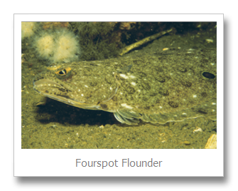
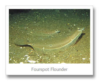
Many of Marty’s suggestions started with a statement like “Great Photo” or “I Love This One.” One day, the unthinkable happened. Marty started a suggestion by saying “I don’t think that this is the right photo.” My first reaction was disbelief because I thought it was a really good photo. He agreed with me but felt that the photo should show why the fish had the name that it did. The more that I thought about it, the more that I realized how right he was. I changed the photo and really believe that it was the right thing to do. The fish is a fourspot flounder. It looks very much like a summer flounder (fluke) but it has four distinctive spots on its body. The summer flounder (fluke) also has spots on its body but they are not in a distinctive pattern.
The photo on the left was the one that I originally planned to use. The one on the right is the one that I did use. It clearly shows the spots on the flounder which are not evident in the close-up.
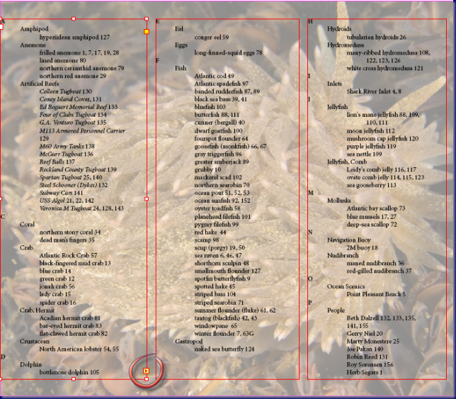
One last hint and it has to do with linking text. I have a Table of Contents at the beginning of the book and an Index at the back. I created some columns and entered everything manually. I wasn’t sure about how to link the columns so that changes would flow back and forth. As with many things that I do, I didn’t bother to find out how to link text until I was done. As it turned out it was extremely easy.
Use the selection tool (arrow) and click on a column. You will see a square box in the lower portion of the left hand column. Click on it and then click in the upper left hand side of the next column and the text will flow between columns. You can do the same between text boxes. I found this out while writing this blog. I told my wife that I should have wrote the blog before starting on the book. I would be way ahead right now. LOL.
The editing work is now complete and I plan to upload the book very soon. My next blog will be the book.
© 2010, Herb Segars. All rights reserved.

